Product Feature "Continue Reading", which increased reading time by +15%
My role: Senior Product Designer.
Team: iOS Team Lead, QA, Frontend, Backend.
Tools: Figma, ProtoPie, Confluence, Jira.
Year: 2023.
1. Summary
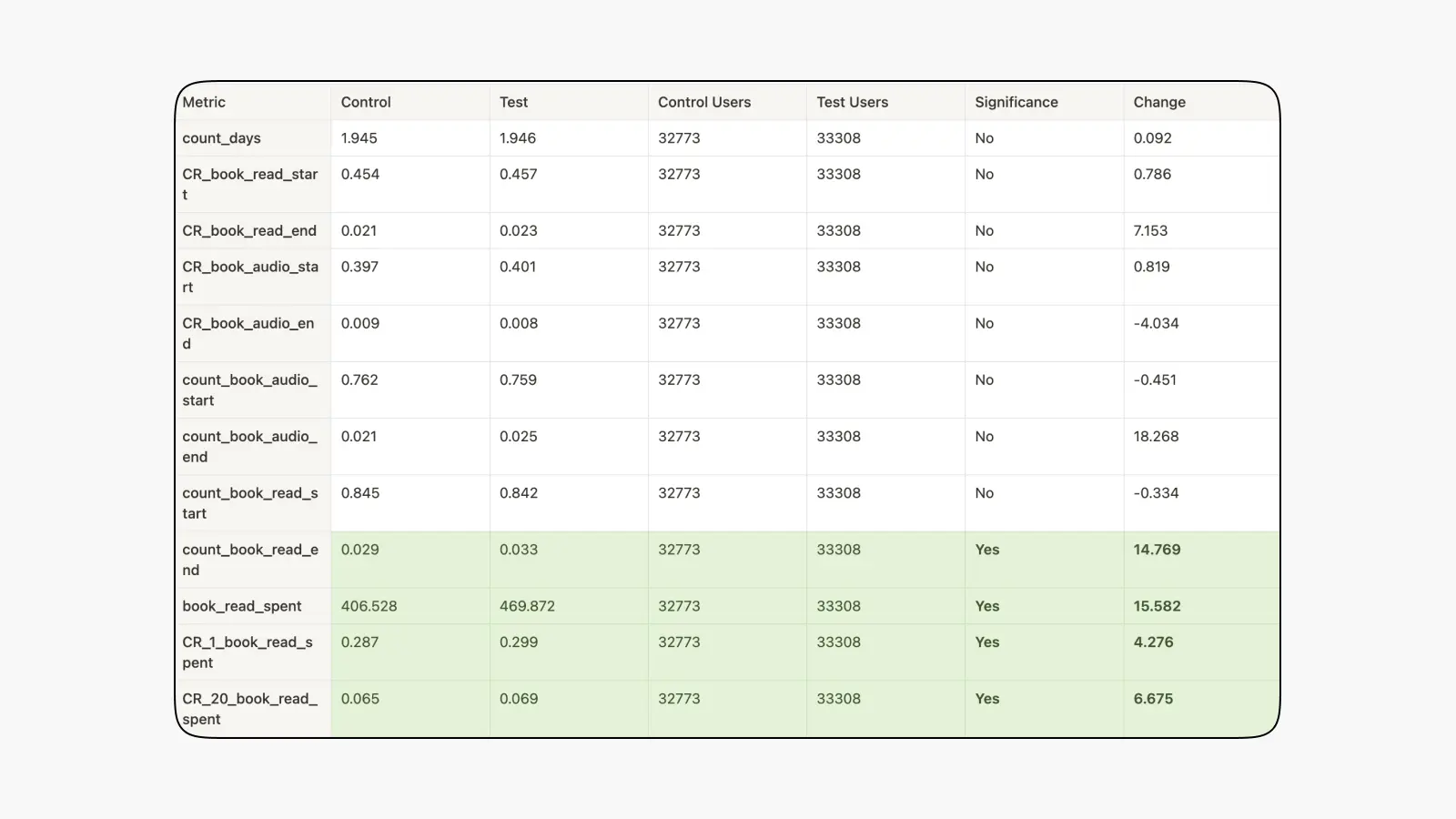
We redesigned the "Continue Reading" feature on iOS but didn't achieve significant results. In contrast, on Android, the average time spent in a book increased by +15.6%, and the average number of completed books increased by +14.8%.
2. About the Task
When exiting a book, the "Read" section's main page has a feature to continue reading the last book. We decided to redesign this element.
2.1. Current Behavior
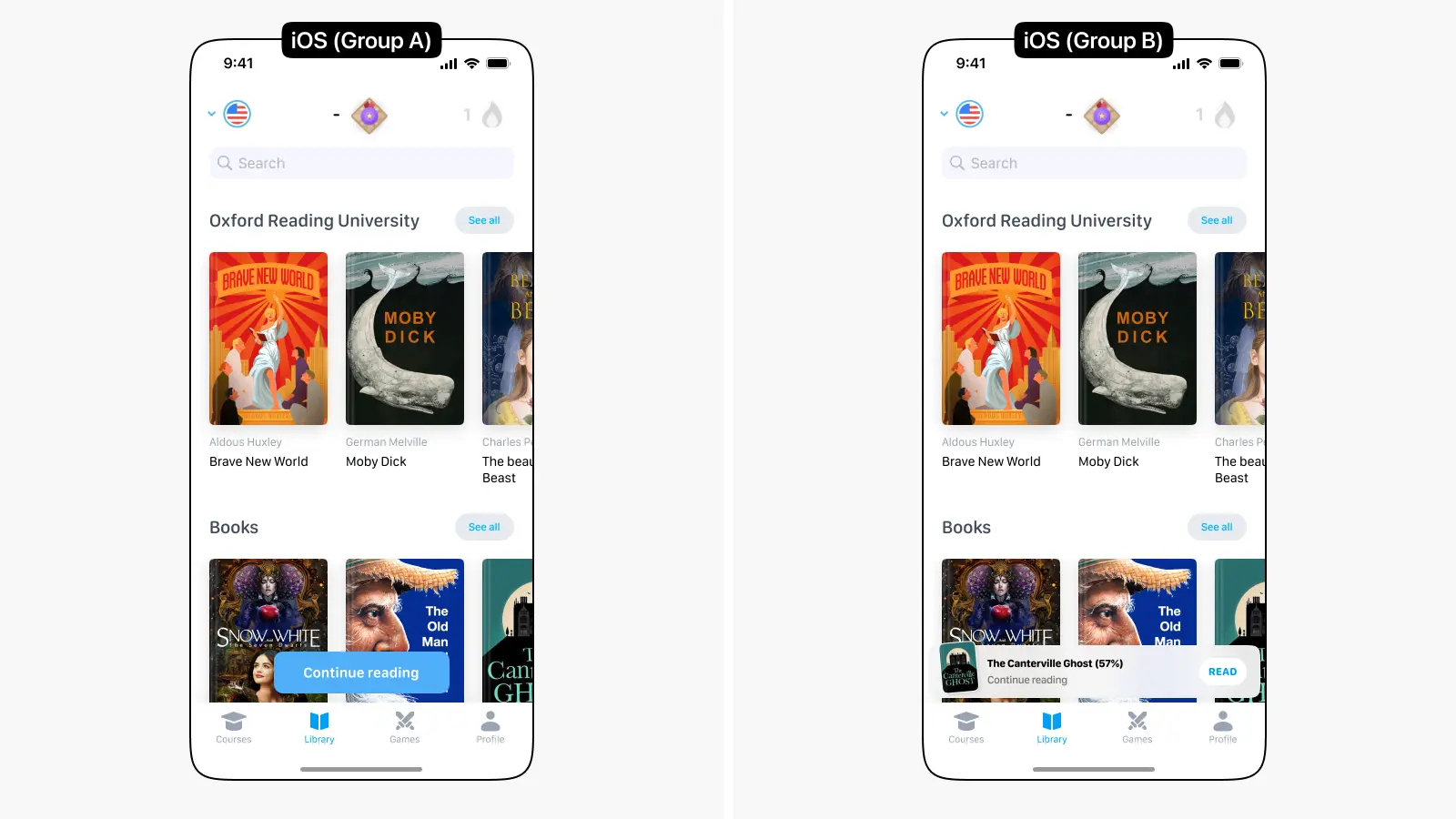
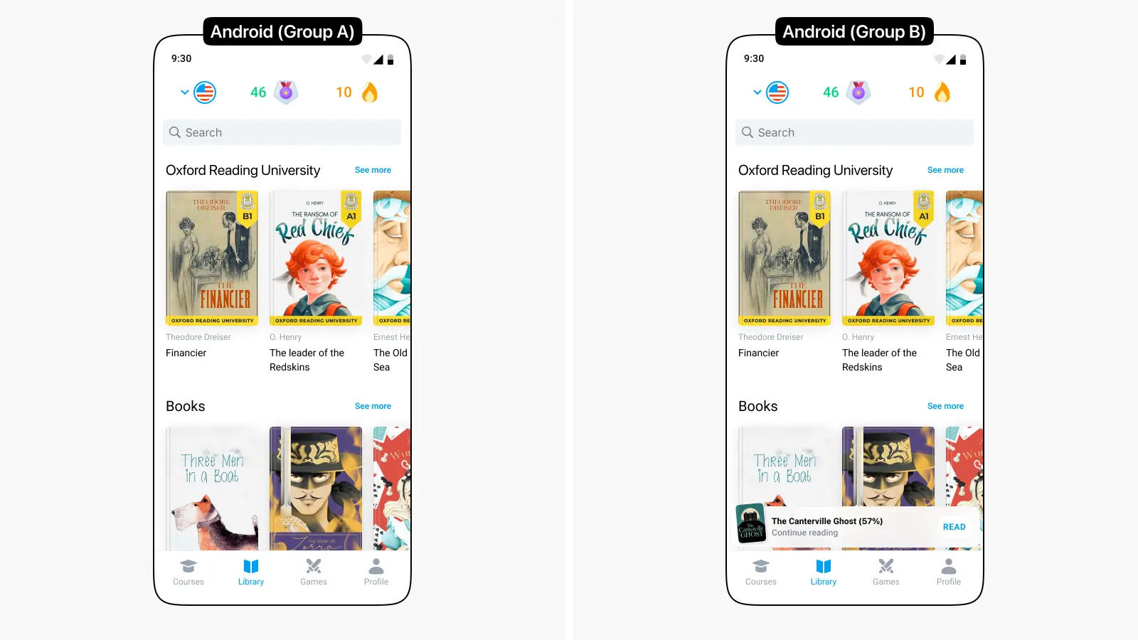
On iOS, this feature is represented by a blue button with the text "Continue Reading," while on Android, users do not have a quick option to return to the last book.
2.2. Hypothesis
If we redesign the "Continue Reading" feature and make it more informative, we can increase user return rates to reading and, as a result, improve book completion rates.
To test this hypothesis, we launched an A/B test, in which:
iOS:
- The control group (A) remained unchanged: blue "Continue Reading" button.
- The test group (B) received a new design for the "Continue Reading" feature.
Android:
- The control group (A) remained unchanged: there was no "Continue Reading" feature.
- The test group (B) received the "Continue Reading" feature.
Target Metrics for Both Platforms:
- Average time spent in the Reader (tracking conversion for >=1/2/5 minutes of reading).
- CR for book completion.
Controlling Metrics:
- Active days — how many days the user accessed the Library screen during the experiment (average per user).
- Average number of started books (expected to possibly decrease).
4. A/B Test Results
For iOS, no significant changes were observed; nothing increased or decreased. The redesign hypothesis was not confirmed.
For Android, the average time spent in a book increased by +15.6%, and the average number of completed books increased by +14.8% for new users. It can be assumed that the design of this feature does not play a major role, and the functionality itself is more important. Since Android previously did not have a similar solution, these are very good results.
As a result, we implemented the new look of the element on both platforms to ensure consistency.
Calculations for Android