The new lesson report form increased the number of daily reports by 4 times
My role: Senior Product Designer.
Team: iOS Team Lead, QA, Frontend, Backend.
Tools: Figma, ProtoPie, Confluence, Jira.
Year: 2023.
1. Summary
Implementing segmented tickets into the feedback form has significantly improved the quality of educational content and increased user loyalty. We also increased the number of daily requests from 50 to 200, allowing us to identify bugs in lessons faster. This, in turn, positively impacted lesson completion rates and increased LTV.
2. About the Project
We wanted to improve the error reporting system in the lessons section of the app. The main goal was to ease the process of submitting complaints about content issues, which should lead to better product quality and enhanced user experience.
2.1. Problem
In the lessons section of our app, there were many content problems. Users often complained about incorrect translations, missing images or videos, and sometimes couldn't complete a lesson due to localization errors. Our support team didn't have enough data to identify and fix these issues promptly.
2.2. Hypothesis
We assumed that updating the error report form would lead to more transparent analytics on translation quality and allow us to:
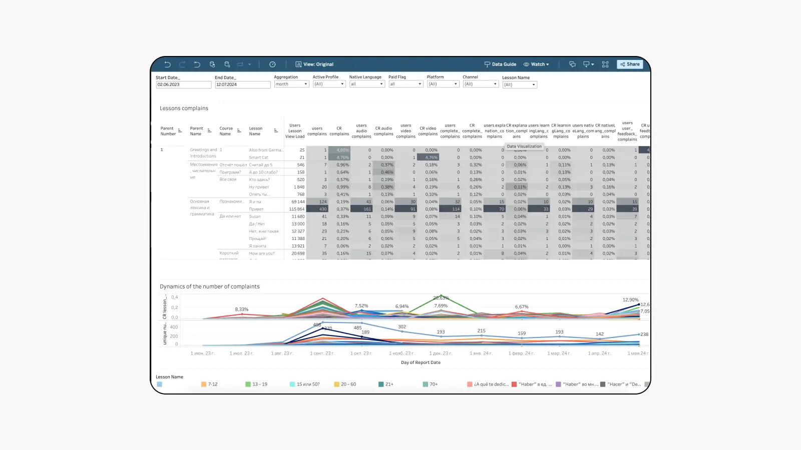
- See how the number of errors correlates with key metrics: completion rates, time spent in the app, and subscription duration.
- Set priorities for implementing the content proofreading process.
3. Design
3.1. Previous Behavior
In lessons, there is an envelope icon at the top. Clicking on it takes the user to the support request creation screen. This implementation requires a lot of time to send a ticket, as the user needs to write the request text and leave their e-mail to report a problem. Not all users are willing to spend this time.
This behavior violates the following principles of user interaction with interfaces:
- Minimizing user effort: Users prefer interfaces that minimize their efforts. Filling out a long form requires time and effort, which can deter many users.
- Clarity and simplicity: The interface should be intuitive and simple. Requiring users to fill out complex forms to send a ticket can cause confusion and discomfort.
- Reducing cognitive load: Users shouldn't be overloaded with information or complex tasks. Filling out a form with several fields increases cognitive load.
- Quick problem resolution: Users expect fast and efficient support. Filling out a long form to send a ticket slows down the problem resolution process.
3.2. New Behavior
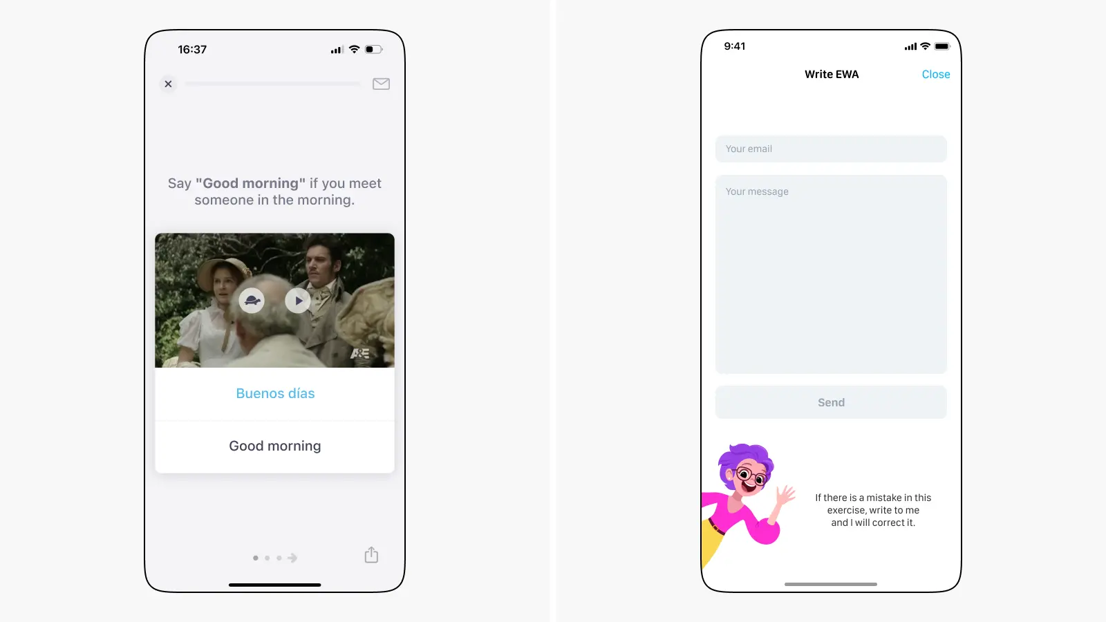
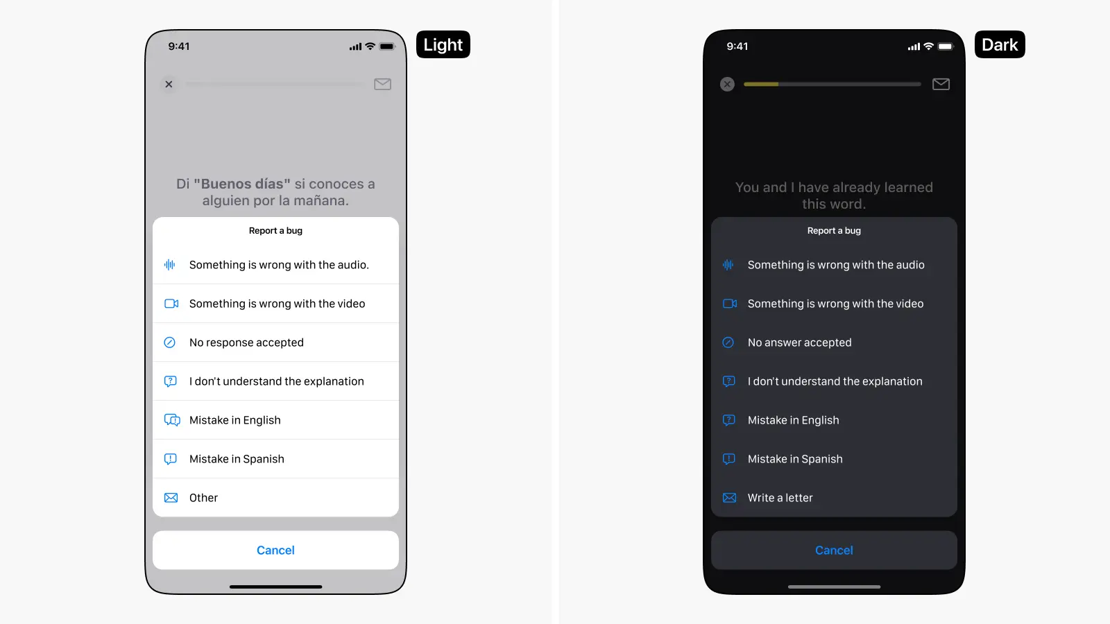
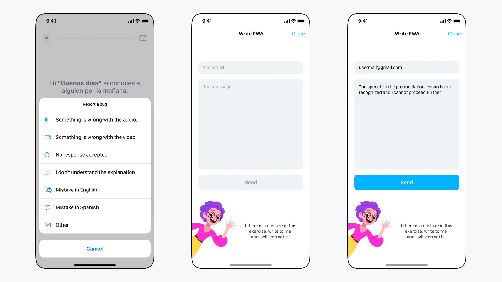
In the new design, we added an Action Sheet that appears after clicking the envelope icon. It presents a list of quick actions. Users no longer need to put in effort to send feedback. Now, they just need to pick one of the options to send a complaint to support without entering their email or comments.
We also kept the previous scenario with the full form, but moved it to the "Other" section for users who need support assistance or have improvement suggestions. To use the form, the user needs to click on the "Other" section and fill in the form data.
We collect error reports in both learning and native languages. To make these points clearer and avoid general phrases like "Error in learning language" and "Error in native language," we use localization keys for each of them.
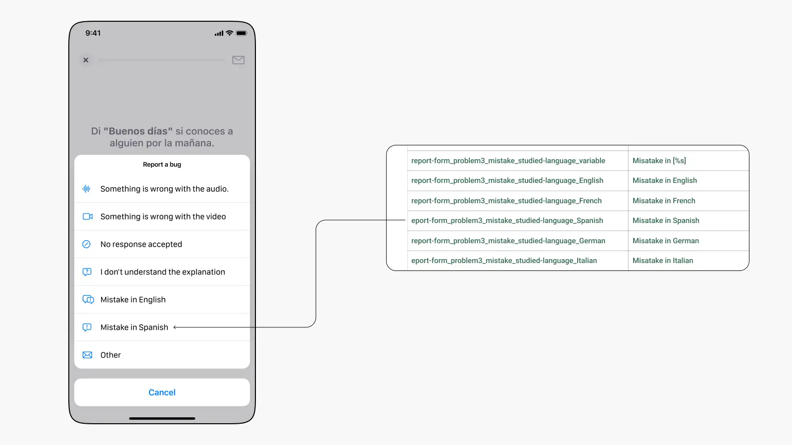
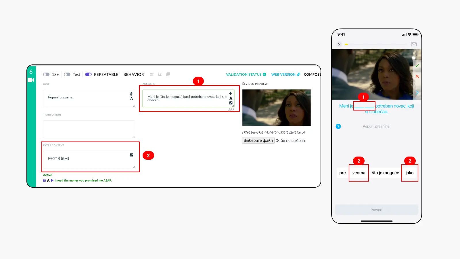
By adding the "No response accepted" option, we solved one of the biggest problems. Previously, users could get stuck in lessons due to translation errors. For example, the admin panel might have a phrase to translate: {Is} {David} {here}? with clickable words in curly brackets. Sometimes, translators forgot to leave the curly brackets or replaced them with others, which created difficulties in the lesson. Now, if the user faces such a problem, they can choose the "My answer is not accepted" option, report the error, and skip the lesson to continue learning.
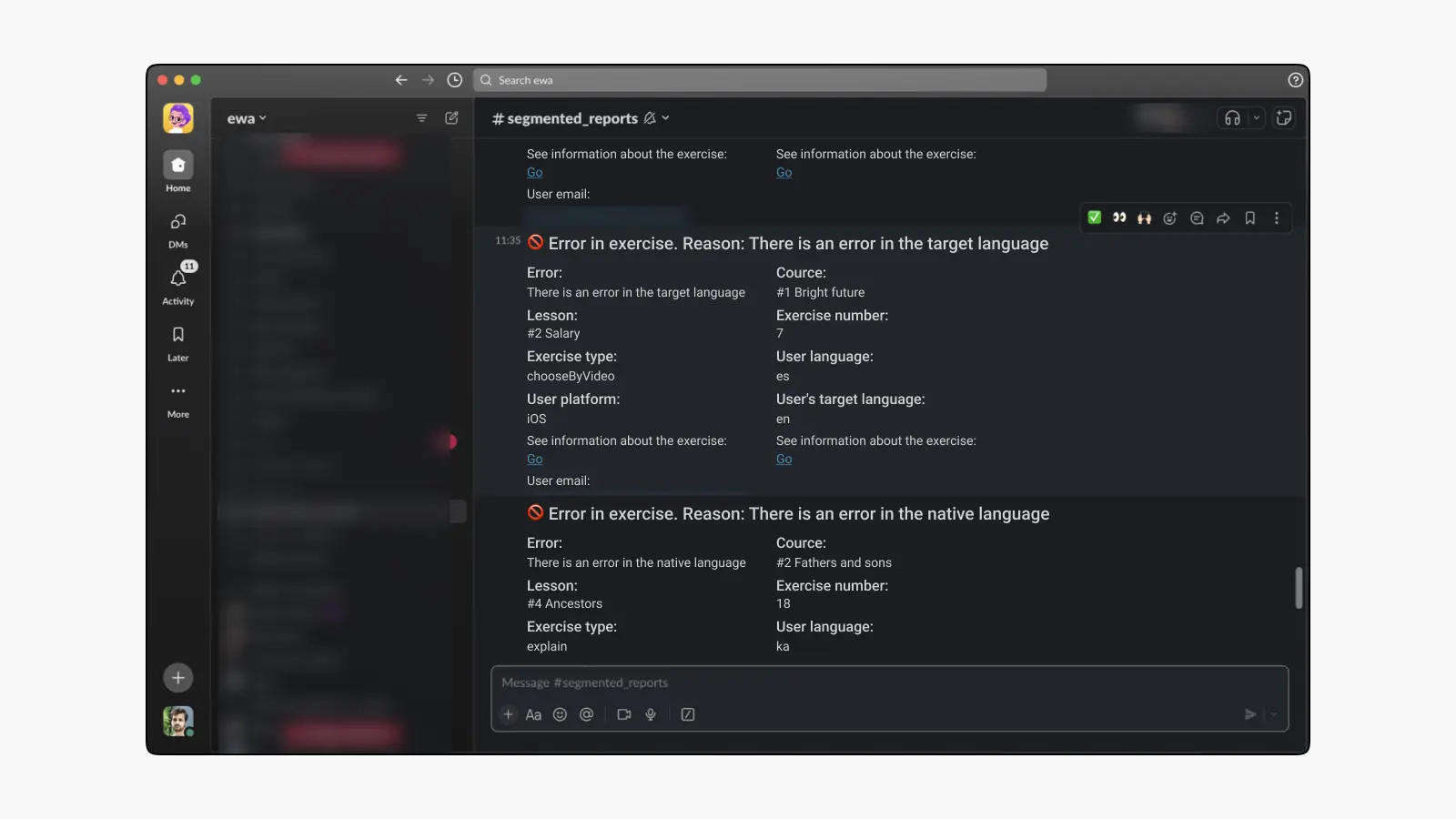
Reports on major issues are sent to the #segmented_reports chat. The report message immediately shows the main parameters and allows access to the exercise admin panel and user information.
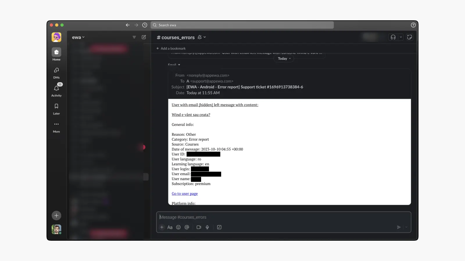
For the "Other" option, reports go to the #course_errors channel. This also contains all the necessary information about the user and the text of their message.
4. Conclusion
The implementation of the new feedback form and segmented analytics has significantly improved the quality of educational material. Users have become more active in reporting issues: while we previously received up to 50 reports per day, we now get 200 or more. This allows us to quickly identify bugs and plan their resolution.
The localization team can now find and fix text errors faster, positively impacting content quality. Additionally, thanks to our analytical dashboard, they better understand which lessons are the most problematic and can use a data-driven approach.